
Critical (graphic) Design School
本誌未掲載の「クリティカル・(グラフィック)デザイン・スクール」英訳ページをアップいたしました。ぜひご覧ください。
p. 144
3, Feb, 2018
11:00-19:00
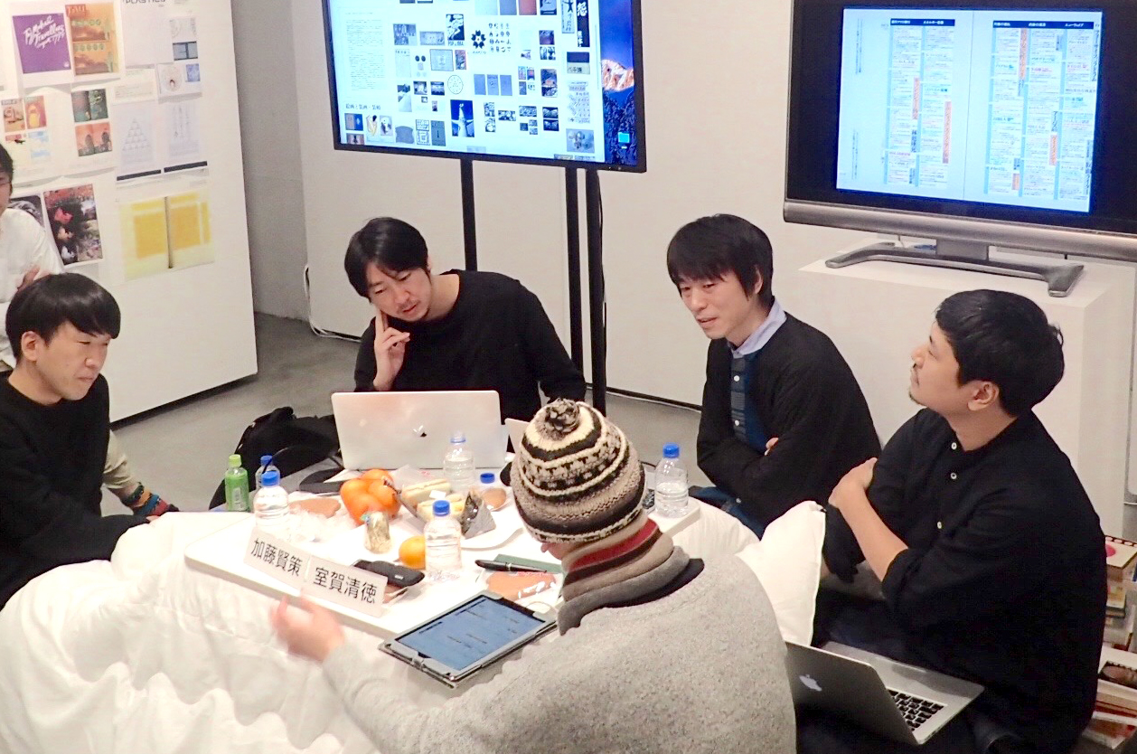
Direction
Kensaku Kato, Kiyonori Muroga
Guest
1st Class: 90s
Koh Chihara, Ryoji Tanaka, Jujiro Maki
2nd Class: 80s
Yuta Oda, Natsuko Yoneyama, Mina Tabei
3rd Class: 70s
Yoshihisa Tanaka, Takeo Nakano, Daijiro Ohara
4th Class: 60s
Takasuke Onishi, Sakura Nomiyama, Jun Kawana
5th Class: 50s-
So Hashizume
The critical (graphic) design school aims to visualize how contemporary graphic designers who are active, on the extension of the design history, think about it. This is an attempt for designers to re-examine and discuss history through their own perspectives and explore awareness of the problems and perspectives for the future by referring to the history of graphic design which paralleled by postwar high economic growth from the 1950s to the 1980s.
The event was held as a form of a lecture in reverse chronological order, the 1st period = the 1990s, the 2nd period = the 80s, the 3rd period = the 70s, the 4th period = the 60s, the 5th periods = the 50s.
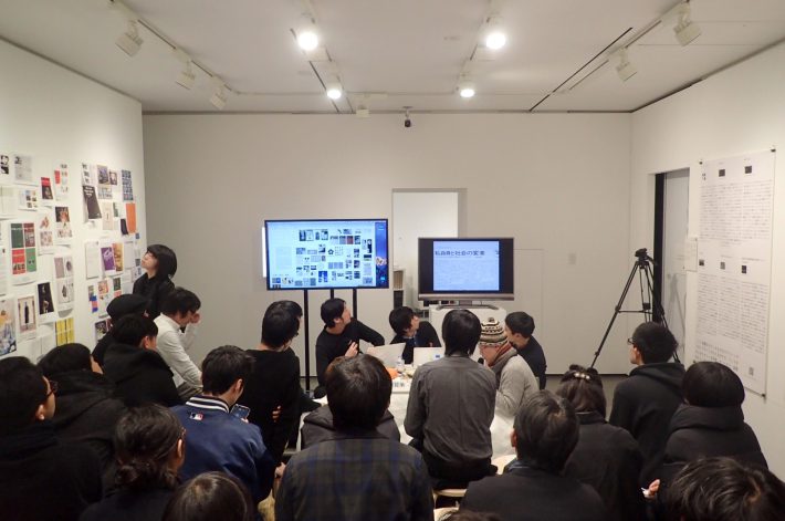
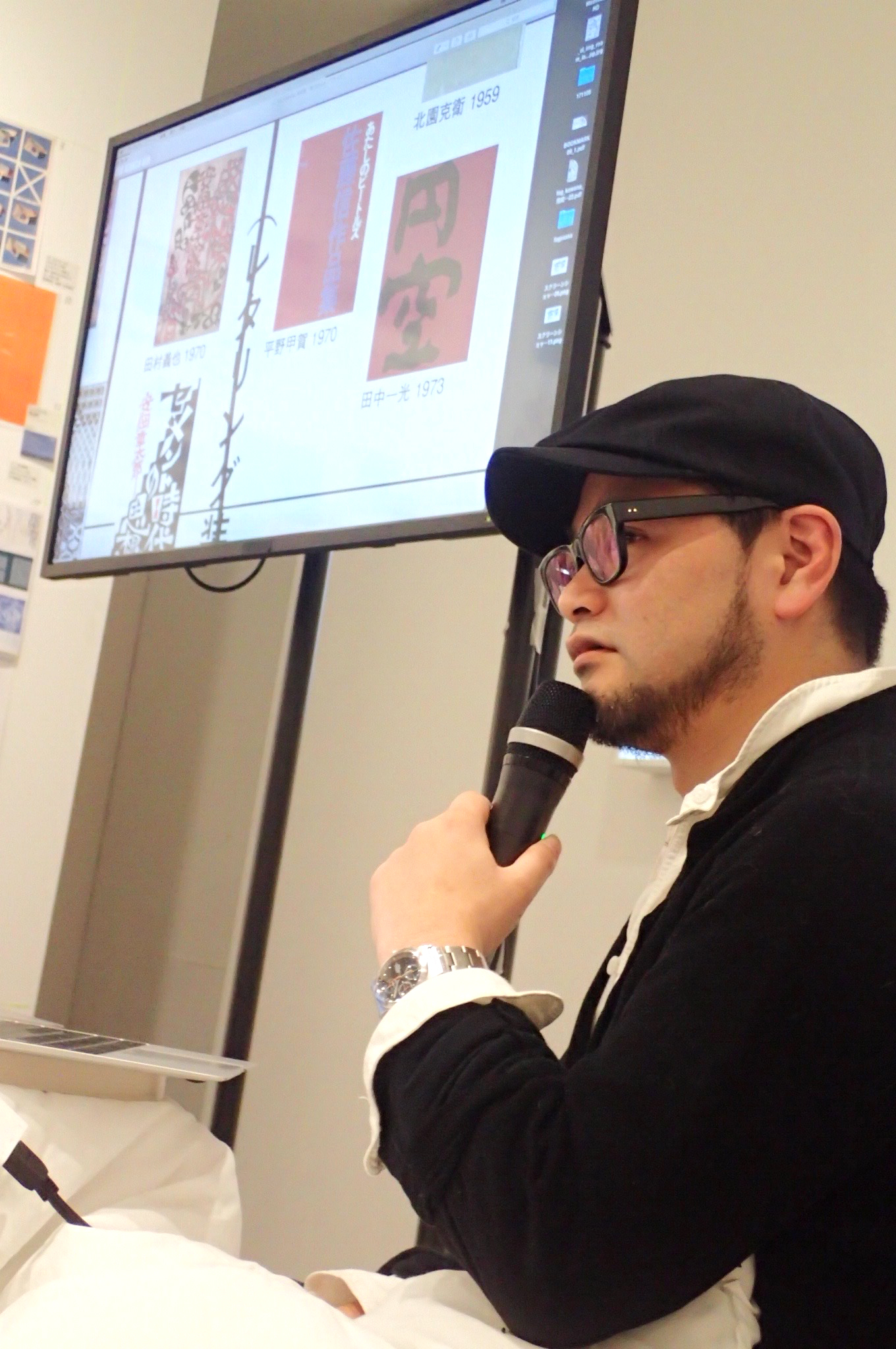
We set up a white kotatsu at the venue as a device to recall the historical phenomenon of graphic design. While the snacks related to the designer was provided intermittently, the event lasted 8 hours without breaks. Descriptions of the individual viewpoints based on the exhibition of Room A were omitted due to space limitations, parts of the central topic of each era are compressed and re-edited and introduced here.
p. 145
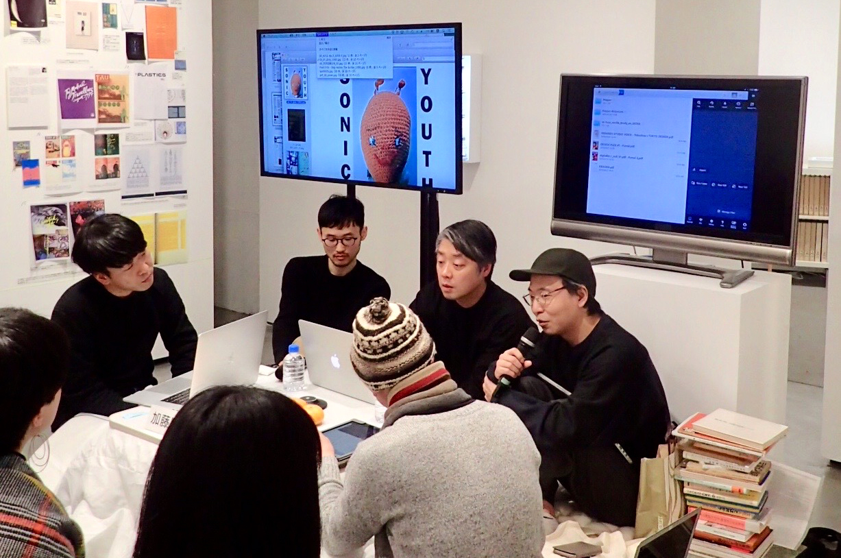
The 90s
Koh Chihara, Ryoji Tanaka, Jujiro Maki
What Mackintosh and digital culture changed
Koh Chihara, born in 1972, looks back on the 1990s. In the 1990s, the digital technology provided an environment where individuals could release work of design. For him, designing on the Mac was very attractive. There were also signs that the conventional growth process as a designer had changed. In other words, he felt that he might be able to work as a designer even if he skipped traditional technical acquisition or apprenticeship training at the design office.
Also, as Chihara himself participated in it, like the happening art “THE GINBRART” (1993) which took place suddenly in Ginza, each player started to work on his own in the art industry as well.
There was an expectation that the whole industry including art and design seemed to become more interesting. In that situation, Chihara in 1991, started to work under Hajime Tachibana, whose poster “APE CALL FROM TOKYO” got the ADC highest award. “APE CALL FROM TOKYO” has a visual with de-constructed typography, I had no idea of how it was designed, and it seemed as if Tachibana had made a new model with new painting materials, Chihara said.
Meanwhile, Ryoji Tanaka talked about how he had been involved in the rapidly developing digital media world. He was originally learning to program for the simulation of physics research at an university. He entered IAMAS in 1998 trying to discover a connection with music, movies, fashion and street culture that he is interested in.
What Tanaka was most interested in at the time was packaged interactive content including CD-ROMs. From the mid 90s, mainly on DIGITALOGUE presided by Naomi Enami, and also graphics designer Matsumoto Gento and contemporary artist Hideki Nakazawa involved, there was an attempt using CD-ROM and floppy disk. It had some effect on Tanaka. Among such trends, Tanaka devoted himself to programs and graphics utilizing Macs.
Digital media and Robundo
From the late 1980s to the mid-90s, the trends of new typeface design and typography with postmodern historical viewpoints free from conventional typographic designs, including California’s type foundry “EMIGRE”, and an experimental font project “FUSE” by Neville Brody in London had great influence.
Chihara was also influenced by its overseas trends, under the tutelage of Hajime Tachibana, radical designer who was an early adopter of digital tools in Japan. He said that while enjoying the “anything-goes” spirit of the sampling culture unconstrained with the historical context, he also began to have concerns about whether it would be all right to keep it as it is.
At that time, in a book issued by a printing and typesetting company, Robundo in Shinjuku, which also publishes typography-related publications, he read the article of “EMIGRE”. He learned that designs consumed as “just a cool new overseas Graphics” in Japan in the 1990s actually were created with a clear perspective on the history of design.
Even though he wanted to know about the history of Western typography, there were almost none of the Internet and books at that time. Robundo was a precious source of information for him and it led Chihara to enter the typography school “Shinjuku Private School” of Robundo when it had opened.
Difficulty of preservation of digital contents
Jujiro Maki, who was born in 1985 and was still a young child in the 1990s, pointed out that the digital contents of the 1990s were hardly recorded on the Internet when trying to examine the situation in the 1990s. Since the operating environment such as computer and OS has changed, the program itself does not work. Also, even if it is currently on the Internet, when the site administrator runs out, the contents of each server will entirely disappear, and future reference possibility can not be guaranteed. Even if it is left in the video, the problem remains that it can not be played depending on the format of the video.
In response to it, Tanaka introduced an ironical episode that he concluded that “we must also leave the content in the form of a book” in a dialogue with designer, exonemo’s Kensuke Sembo who has been experimenting in the digital domain.
Chihara pointed out that artists who were responsible for street culture may have thought that it would not be cool to explain their activities with words.
And Chihara appreciated highly Naohiro Ukawa’s willingness to explain his works and record them compulsively.
Muroga said that just as the Denki Groove logo, which became a visual icon of techno music, referred to modernist corporate lettering in the 50s and 60s and avant-guard art typography in the early 20th century reappeared in destructive digital typography, the 90s graphic was also characterized by remodeling and remixing of modern design history of the 20th century.
The 80s
Yuta Oda, Natsuko Yoneyama, Mina Tabei
Age of team play
First, Yuta Oda pointed out that collaborations with photographers and copywriters and collaboration between autonomous creators were rich in the booming advertising designs in the 1980s.
Oda referred the case of the mobile phone “PENCK” which Saito Makoto was involved as a creative director in the 2000s. (He was criticized for being announced as a designer of the characters of the numeric keys of the product, although he actually used the free font “Major Kong”.) He said that communication with the cooperating people and commitment to society were important for the function of the designer. He also mentioned that there might be a part of the hints of the ideal way of team system in the 1980s’ design.
Natsuko Yoneyama mentioned the Shiseido magazine advertisement series by Kazuhiko Ota and Bishin Jumonji. She said that the collaboration of art-related advertisements, which were realized in lifestyle magazines and fashion magazines of the 1980’s, was a symbol of a kind of richness.
Following this, Oda showed the advertisement poster of “Iichiko” by Hideya Kawakita as an example of collaboration with understanding clients. Oda once had the opportunity to interview this shochu manufacturing company. The client said that all the contents of the advertisement were left to the designer and they did not intervene at all.
In addition, he pointed out that there was a side to disseminate unknown value at the time that is not bound by the existing market method and data method like today in advertisement production at that time.
He said that the design of the Tokyo Olympics designed by Yusaku Kamekura was created by the team play, that is, the connection between the individuals. Now that the star system of the designer collapsed, he expected that the age of team play would come again.
Then Mina Tabei talked about her private memory of “the 80s”. She explained how she was excited by an album “Pearl Pierce” of Yumi Matsutoya which Kazuhiko Ohta designed and a booklet of a musical “Annie” which Shigesato Itoi and Katsumi Asaba designed. Her presentation had the most rilaxed air in this event.
Moderator Muroga explained about “Nippon Graphic Exhibition” as an important art and design event of the 1980s, which former speakers did not mention. It became a place to receive the desire to express by the art college student of the time and it became a trigger which prominent living artists and designers such as Katsuhiko Hibino and others made their ways to the mainstream. It also established a unique expression space that could not be defined either art nor design and prepared the 90’s subculture.
p. 146
The 70s
Yoshihisa Tanaka, Takeo Nakano, Daijiro Ohara
The texture of graphic design
Takeo Nakao explained social functions that the map and diagram played in the 1970s while explaining his exhibition commentary. In the 1970s when high economic growth settled after the Expo, the viewpoint of the macro scale of technology and environment and the human scale of personal life were antagonistic, and maps and diagrams are necessary as a tool to connect them.
Nakano said that the challenge of contemporary diagrams was how designers present subjects in an interesting way in quality, based on the amount of information and complex data. The method of deconstructing without being bound by the framework of the system might be in common with the attitude of intermedia discussed by Tanaka.
Daijiro Ohara pointed out a characteristic texture of the surface of Nakano’s showcases. He presented that the design has usually an overall “texture” that is not reduced to color or shape, and that there seemed to be a large gap in the texture between the current infographics and the diagrams in the 1970s made by Kohei Sugiura and others.
After that, Ohara discussed the “curve” with the longest historical span and high degree of abstraction, among the thirteen “declarations” in their own exhibition theme.
After that, Ohara in his exhibition theme discussed the “curve” with the longest historical span and the highest degree of abstraction, among the thirteen “fragments”. He emphasized the necessity of instruments to draw lines including conceptual and invisible things such as lines of sight and traffic lines as well as visible lines, and tools and the history of the tools decided activities of artists and their history.
Discussions were also held on common themes with Nakano, including lines of scores describing temporal changes of things, automatic writing, and lines based on calculations.
Desiners’s commitment
Yoshihisa Tanaka mentioned about the contemporary possibilities of “Intermedia” which directed the activities of Jikken Kobo (Experimental Workshop) in the 1960s, including the relationship with his exhibition plan. Tanaka said that he was affected more by the manner of expression of attitudes and the way of development of the project than the expression of the intermedia artist at that time.
In addition, Tanaka said that he saw the criticism which now disappeared functioned in the books and magazines he had examined for this exhibition.
There were criticizing power, criticizing catering to power, or criticizing exhibitionism of the leading occupation “designers” during the period of the Expo ’70 and dissolution of Japan Advertising Artists Club around the 70s. and He pointed out that they were valid also in the current situation.
On the other hand, he said that it was important how we would be free from a simple thinking framework, which only replaced the Japan Advertising Artists Club as a “virtual enemy” with JAGDA, and to think how we would escape from it.
Muroga mentioned what the similarity meant and pointed out that Marxist-socialist criticism in the 60s and 70s, “designers were puppets of capitalism” were transformed and survived in the disparity brought about since the 2000s by the informational society.
In the discussion that follows, it was pointed out that the transition from the typography of the 1970s to the phototype / offset was the foundation of the booming of editorial design and advertisement expression afterwards, and It was confirmed that as Kohei Sugiura headed for Asia, the modernist faith settled, and it went into the era of seeking each value.
The 60s
Takasuke Onishi, Sakura Nomiyama, Jun Kawana
Repeated desire for identity
Takasuke Onishi first talked about the anxiety about the modern “homogenized world”. After the Great East Japan Earthquake, many people worked as designers based in rural areas and returned to their hometown. he claimed that although it seems that there were more opportunities to think about where we belonged to, the issue of identity had changed over time in each era but it existed all the time.
Onishi said that there rose a question “what a radical thing was” beyond such “indigenousness”. He referred to Taro Okamoto’s “Jomon culture” and “Yayoi culture” discussed in the book ”Japanese tradition”. Taro Okamoto premised that “Jomon” and “Yayoi” both were the roots of Japanese culture, and explined importance of “Jomon”. the modern age is Yayoi and Jomon-like things are important.
Onishi sympathized to Kiyoshi Awazu and Tadanori Yokoo, who embraced vanishing original landscapes of Japan in their work adversely in the reaction to the booming of modern design with the peak year, the Tokyo Olympic Games in 1964. Onishi emphasized the importance of recognition of self in relation to the society.
While focusing on the development of domestic indigenous image representation, Onishi also stated about the Japonism image strategy developed in the context of foreign advertisements and corporate advertisements since the war. He mentioned that national identity problem always recurs.
I think this repetition is a fate of Japan that has absorbed the foreign culture and now that people have little interest in overseas, I am very interested in how Japanese desire for self identity is changing.
Autonomy of graphic designers
When Jun Kawana saw the exhibits of other participating designers, he felt there was a gap between his main field, book design.
According to Kawana, the theme of each presentation seems to be rich in the theme of the designer’s own, but there is no room for including his own story in book design domain and its problems.
Kawana felt uncomfortable with the individualistic theme featured in design magazines since his school days. And he confessed that the feeling was deeply seated.
Kawana’s remark raised the old theme, designer’s subjectivity and objectivity, again. Nomiyama specializing in design history pointed out that there were changes in what the world wanted designers to do, or what the world thought designers to be, and social cognition of designers by the times.
Muroga again said that the “Persona” exhibition in 1965 became a turning point for each individual designer becoming a social changer and trying to offer a vision based on “individuals”.
The following session focussed on as it follows: even though the issue of social responsibility of designers which germinated in the trend of the Good Design Movement of the 1950s to the World Design Conference of 1960 reached a climax with participation in the Tokyo Olympic design plan of 1964, it was stalled afterward. The necessity of investigation of the reason why it was stalled was also discussed.
So Hashizume explains about his exhibition, while the light headings of the question mark type are mostly in the 1950’s, and about the way the articles are more cataloged and specialized in the 1960’s. He saw the overlapping motivations of both defining the design and reconstruction from the war in the 1950s.
In addition, Hashizume has discovered the parallelism of the design and visual image rejecting categorization by the existing concept seen on the modern internet, parallel with the circumstances and problem consciousness at the time.
Nomiyama picked up featured articles of Savinyak in the first issue of “Idea” and referred to the intelligence and cultural accomplishments of the reader who knew the nature of the advertised product and understood humor. He pointed out that the term “design” included the middle-class way of thinking and hierarchical society in the background of that time.
Kawana pointed out that in the modern advertisement designers were responsible for the decoration of planes and solids, and that in many cases the artist did the pioneering work of the kind.
He said that Hisui Sugiura, Yumeji Takehisa, and Koshiro Onchi were said to be a pioneer in modern graphic design nowadays. This is because the subject of “design” has been expanded considerably. He explained that they might have defined their practices by their own words and perceptions before the word “design”.
p. 147
The 50s
So Hashizume
Similarity between modern and 50s
Hashizume extracted the headings in which “!” and “?” were used in “Ideas” from the first issue to the 100th issue and composed the exhibit.
He pointed out that there was a big gap in the design recognition between the design industry and the general society, referring to a dispute about the logo of Chiba prefecture designed by Masayoshi Nakajo in 2003.
He also argued how to explain the “goodness” that can be understood in the context of the designer to ordinary society, and that a language to translate designs is increasingly required.
From “zuan” to design
The session entered the final stage and Nomiyama said that he should reconsider the times when the present “design” was “zuan”. Earlier in the 20th century, before the word designer was established yet, he said that they might have defined each practice being prepared to be called a “zuan creator”.
Based on this, Nomiyama summarized the session. He said what is needed for contemporary designers was to learn the background and development of the establishment of the word “design” as a Japanese word and to have a viewpoint to relativize “design” again.
Muroga mentioned the definition of “design” and its acceptance in Japan. He said that not based on “correct definition,” design activities had to be found comprehensively in discrepancies between understanding and practice and the dynamism generated by them, and in addition to modern and postwar spans, he hoped that there would be something we could see by re-positioning graphic designs on a larger scale of visual culture history.