
Throwback IDEA #375
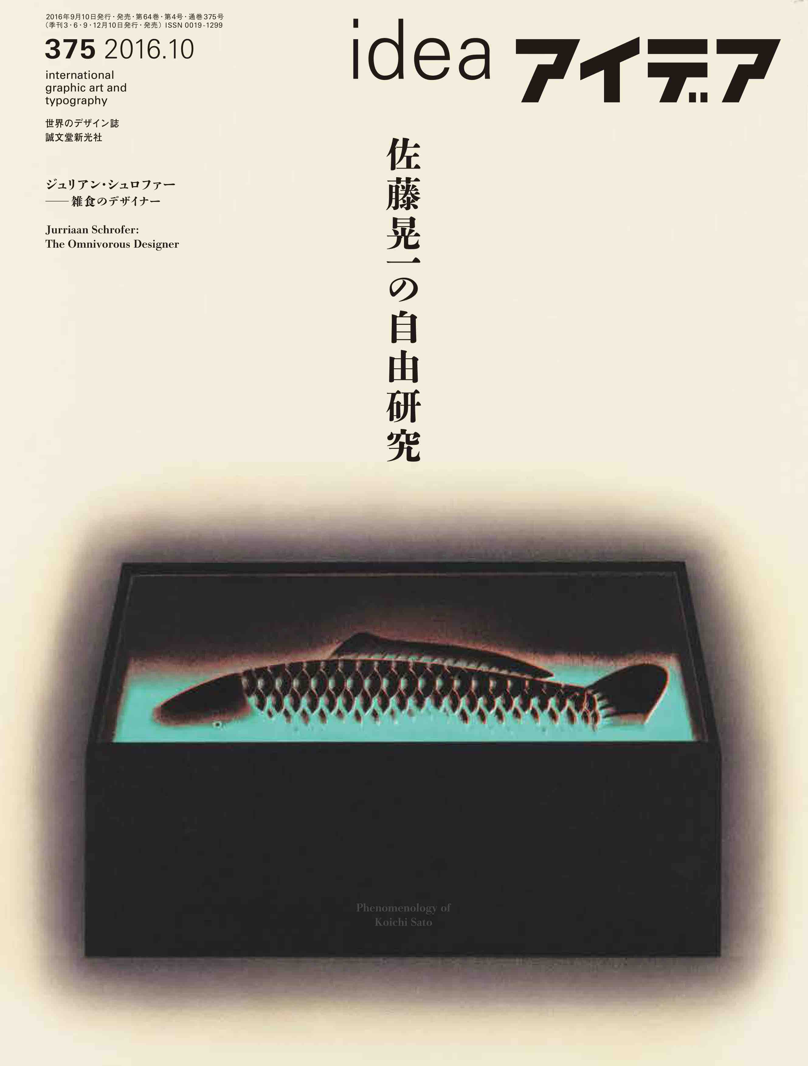
This special feature is a compilation of representative graphic works by Koichi Sato, a leading designer and explorer of traditional Japanese aesthetics in modern design. Sato’s poetic, mystery-filled works are known for their striking colors and reocurring motifs, including boxes, gradation, hazy auras, and luminescent glows. Amid the rise of youth culture in the 1970s, Sato started exploring the possibilities of Japanese pop art and thus developed his own graphic world. His poetic designs gained international recognition and are part of permanent collections in museums all over the world, including the MoMA. A glance into the designer’s graphic exploration will be introduced in this feature, in addition to a reflection on how graphic design can be re-examined now that it is becoming more globalized and homogenized.
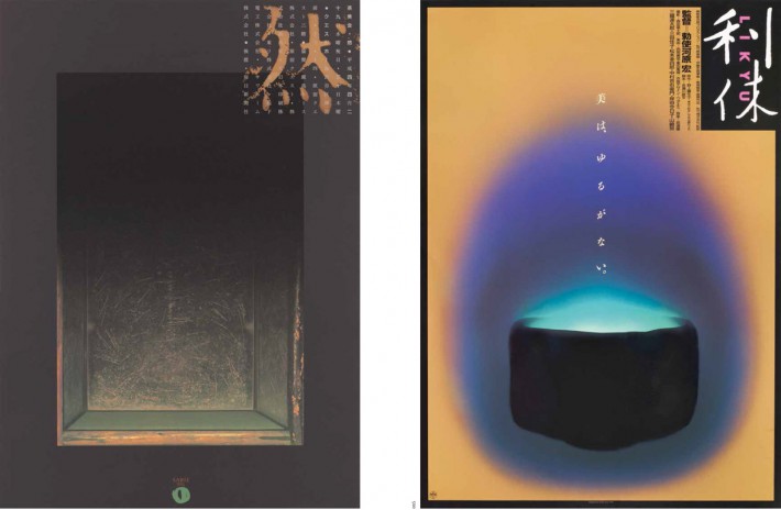
The feature opens up with a group of Sato’s early experimental works, following his experimentation years with box motifs and gradients, and his later design works, which fused the haiku tradition with graphic design. It is also included in this feature excerpts from Sato’s essay “Koichi Sato’s YES EYE SEE”, serialized in the Music Magazine in the 1980s, as well as analysis of his works.
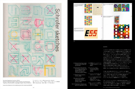
In addition, this issue brings a bilingual overview by Adrian Shaughnessey of the work of Dutch designer Jurriaan Schrofer, one of the leading figures of European design between the 1950s and 70s. Following that is volume 8 of “All we know about Japanese Zines: Zines in the 2000s Part Two: Between Zines and Blogs”; a review of the book DESIGN BY WANGZHIHONG.COM: A SELECTION OF BOOK DESIGNS, 2001-2016; and a bilingual report on the 25th International Poster Biennale in Warsaw.
If you are interested in purchasing this issue, please visit our About page for more information on overseas shipping. To place an order, please go to our online store.