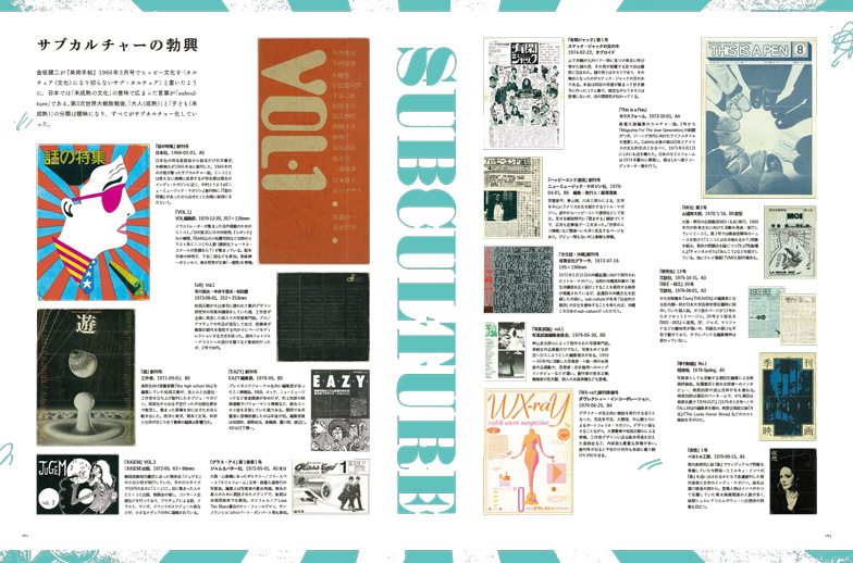
Keyword
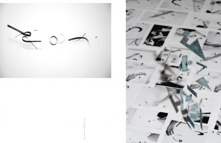
Daijiro Ohara Song Lines
Direction: Daijiro Ohara, & Idea
Design: Daijiro Ohara, Koji Miyazoe, Shinji Honda
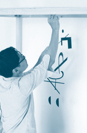
Typogravity
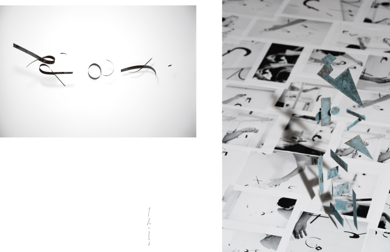
Ridge Line / Katachi
Blackboard / 266 Characters of Hannya-shingyo / Riding on Characters
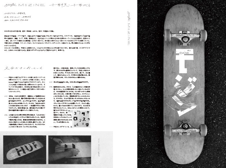
Abstract of “mozine Koga Hirano×Taro Hirano”
Typography: Koga Hirano, Photo & Skate: Taro Hirano
Design: Daisjiro Ohara, Koji Miyazoe
Letterring / Books
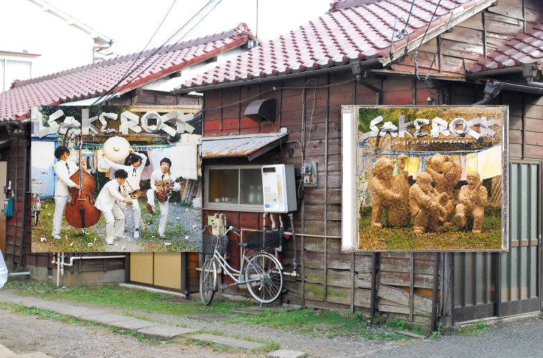
SAKEROCK / MUSIC / Line of Songs
Memory fitting in the body from a Note of Shiori Goto
Editing: Chinatsu Nagamune, Text: Daijiro Ohara
TypogRAPy
Searching for Methods Text: Kiyonori Muroga
List of Works
Mobile of Song Lines
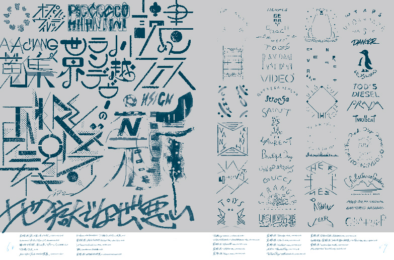
“Syonen-Kusomagazine”
Current design
The modern design is developed within rules of linear technique and economy. The reform of technology challenged those rules, but the reality has been always ruled by the market fundamentalism. In the post-industrialization era, designers becomes more and more an abstract existence in the linear structure.
How can modern graphic designers be recognized under their own name. Independent publications and projects by graphic designers have become popular in the 2000s mainly in Europe and the US. Through those movement graphic designers seemed to have tried to relate themselves with society through their productions in the rapidly developing world economy and the technocracy.
Japanese graphic designers under such an influence those days, and including zine booms, regarded that trend as the fashion of craft, “manufacturing”. Japanese designers have gradually forgot to consider the heterogeneity of “design” of the Western origin after rapid economic growth. Particularly in latest years genericization and commoditization of design methods developed, and people haven’t discussed whether it was appropriate or not, after all they accepted design as it was, and it became a discipline.
Here is one paradox. For Japanese designers to ask themselves “what is design?” became a driving force of critical thinkings and practices while a measure, “modern design” have brought from the outside of Japan. In other words, it may be said that the whole ways of thinking of designers including misunderstandings and perversions brought constant strength in Japanese graphic designs after the world war II. Designers lost dynamics of thought in global informational environment, and the question “what is design?” lapsed into business catch phrases now.
Toward the origins of “hand writing”
It was the mid-2000s, the dying of those graphic designs became an everyday affairs when works of Ohara Daijiro gathered attention. It was design work for music industry with full use of pop hand writings to make him spring into fame. He integrated illustration and texture in modern style adding tastes of commercial lettering after the WWII. While interests for typography, letter, and tastes of craft increased, his styles became popular and produced many followers.
However, those lettering of hand writing is not the point for him, as those were just outcomes of each project’s request and process. He never clang to hand writing, made full of various materials, such as illustration, objects, and photograph as he liked after the period.
The answer what was he interested in gradually became clear through a display project and a workshop held vigorously parallel to client work in the after 2010s.
The main theme of these display and workshops was a relationship between a subject and the world through physical actions like “to write” or “to speak”.
Ohara began to think over it, after he knew that Ishikawa Kyuyo, a famous calligrapher, explained a relationship between human body and the act of creating, such as “to speak” “to write” in his book,”structure of a touch of a brush (p. 83).
According to Ishikawa, “to speak” is “an expressing act of a human being through mobilizing all the functions of physical parts to release consciousness to the air” and utterance, gesture, and performing arts such as singing belong to it. On the other hand, “to write” is “an expressing act through working on objects such as nature with a tool and transforming them reducedly” and letter, drawings, sculptures, and books belong to it.
He was inspired the idea free from the suppression of the institutional division such as “illustration”, “design” or “art” and he began to explore the heart of production through “writing” and “speaking”.
Method and power
Ohara went back to the point where design originally occurred from the given environment divided by the modern concept of “design” and try to comprehend so called “design” field by reconsidering physical actions. Such an application of an anthropological viewpoint may have been overlooked in the Japanese modern design development. “Graphic” comes from a Latin word “gráficos”, so as Ohara has been doing, “to re-comprehend graphic design from the viewpoint of “how to write” is literally appropriate in comprehending set of issues of “graphic”.
However, in Japan for many years as “graphic” has been accepted only in an industrial aspect or the trend of the times, mainly printing, we never stop regarding graphic design as concrete object like “poster design”.
It may be the evil of prioritizing technology introduction to catch up with Europe and the US rapidly or we may have come to realize what the problem was simply because now is the time of the post-industrialization Era.
It is important to know that Ohara’s display and workshop are not privileged as are important to an ex-graphic designer not being a thing made a special privilege as “self-expression” as graphic designers once pretend to be an artist contrary to “the client work”.
As the outcome of the Ohara’s independent project develop in work in the commercial world, commercial environment is a test cite, and also become a start point for the next project.
As well as the cross reference of each project, Ohara also promotes conversion and diversion of methodology and the concept cultivated in other domains such as music. If we pursue “writing”, we are prone to be constrained by the field of pure expression, the way to avoid that and to remain using design as communication is to be conscious of application of methodology of the other field.
Ohara is not only the specialist of handling “letter” as mentioned above, however, his methodology mainly depend on “typography”. It is the typography as musical notation, composing and arranging sets of elements under a certain law, or methodology of recognizing and constructing the world, not the typography as formative art. In that sense Ohara can be called “the person of the method”. In “TypogRAPy, a project with Hasunuma Shuta and llreme, composing musical pieces by going between audible figures and a visible sound images led by a writing act, Ohara’s methodology is going to be raised in comprehensive art at last.
Practice and thought
The word “workflow” and “direction” implies senses of rationality and linearity. Ohara’s way seems to be too complex and wind for this conventional view of the world. How successful have Ohara Daijiro’s series of attempts been? I have no privileges to judge that, but I find something important through apparently pop practices because his complicated methodology has strong persuasive power.
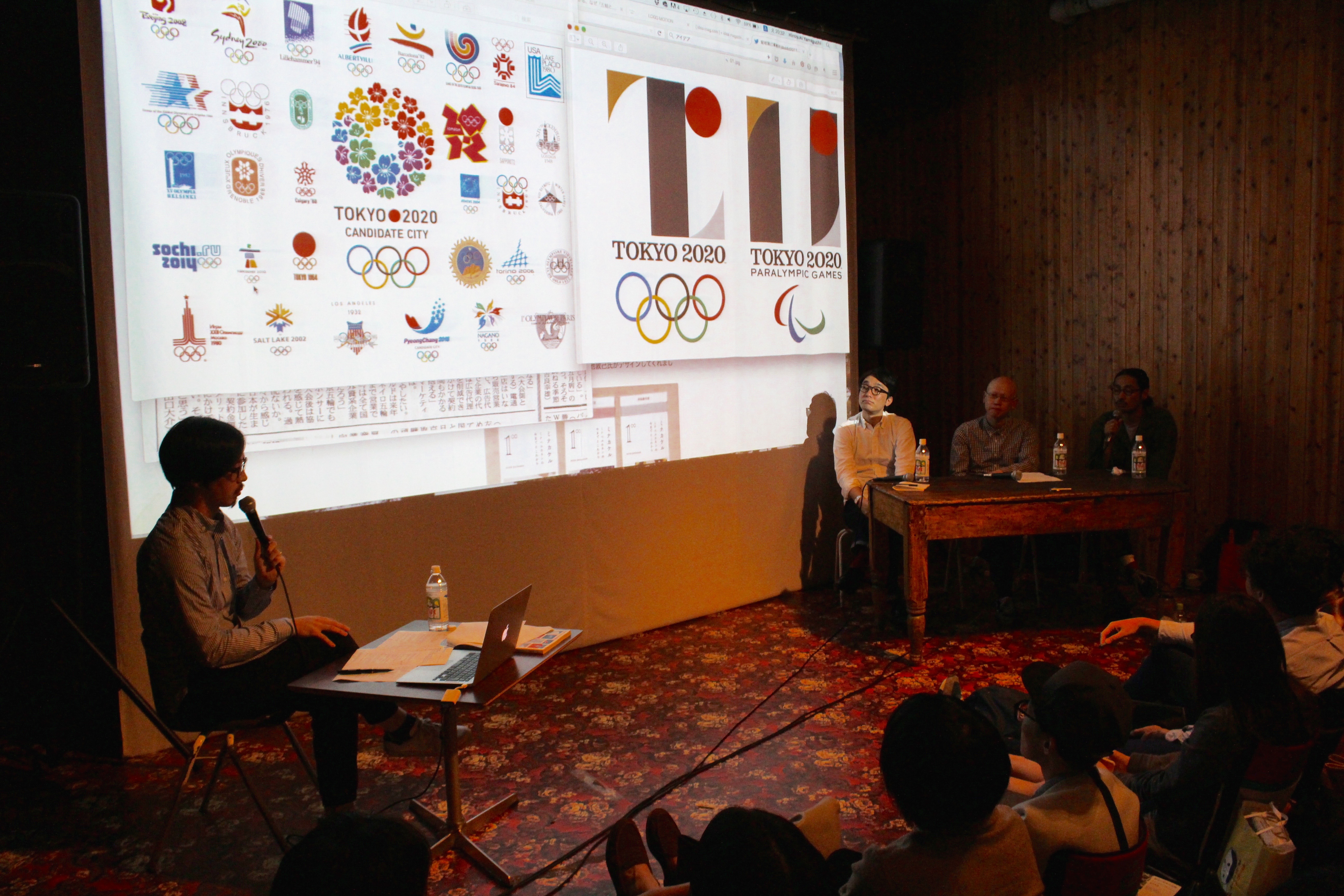
Now that the dusputed issue of the emblem for the 2020 Tokyo Summer Olympics revealed the gap between an institutional frame of graphic design and real information of today, essential questions such as “what is design?”, or”What should design be?” are reappearing after missing decades.
The word “design” is installed in our way of thinking or behavior a circulation circuit and we do not seem to be able to discuss ”design” without using the word “design”, but if we discuss it in that way, after all the discussion is intrinsically barren.
There ought to be methodological turn as Ohara’s attempt to redivide graphic design from the perspective of anthropology or as his repel suppression of the linear communication of the typography by taking over and converting the methodology of typography.
I’d like to watch carefully Ohara’s practical thought and practices through thought process which he has already piled up and is probably continuing from now on.
Daijiro OHARA
Daijiro Ohara was born in Kanagawa Prefecture in 1978. He graduated from Musashino Art University in Tokyo, and started working independently in 2003. He is principal of Omomma, a studio focused on lettering, illustration, motion graphics and art direction. Beside commissioned work for music videos, commercials, packaging and publications, he has also been actively engaged in self-initiated projects, searching for new perceptions of words and letters through exhibitions, workshops and fieldwork. His installation “Typogravity” is an attempt to find the ur-form of letters in landscapes while his project “Riding on Characters” shows how the lettering on a skateboard may be altered by physical and environmental factors. His graphic series “Ridge Line” is the reconstructed mountain photography and trekking map and “TypogRAPy” is his performance with musician Shuta Hasunuma and rapper Illreme. His project “Hello Fukei” is a collection of haiku poetry, expressed via mobiles and illustrations. Ohara was the recipient of the 2014 JAGDA New Designer Award and the 2014 Tokyo TDC Award.
Barbora & Momo Nonaka
All we know about Japanese Zines
Vol.5: The 1960s and 1970s Part One―Post-occupation Japan
Design: Kisa Miyazaki
Yellow Pages
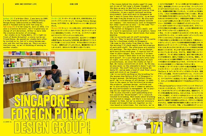
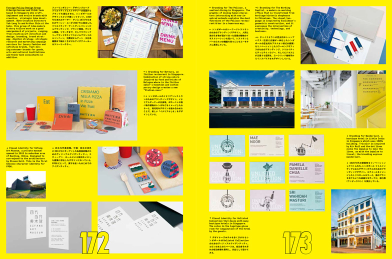
Vol.7: Foreign Policy Design Group (Singapore)
Text: Tetsuya Goto
Associate Editor: Javin Mo
Design: Sulki and Min
MeMe Design School 2015 Symposium
“Between Style and Design”
Guest: Takamitsu Yamamoto and Bunpei Yorifuji
Design: nakagaki design office
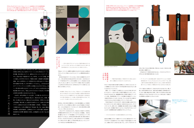
IKKO TANAKA ISSEY MIYAKE
Interview about the New Project
Design: Hideaki Kawazoe
“Moji ni Moji ten” in Shodoshima
Koga Hirano, Osamu Torinoumi, Yokokaku and Koshinsya Printing
Design: Hirokazu Mukai
Cooperation: Shodosima Town
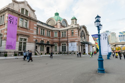
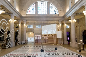
Typojanch 2015 The 4th International Typography Biennale
Design: Hideaki Kawazoe
Photo: Kim Jinsol
Reviews & Information
Movie Review
Book Review
Information & Book
New Type
Design, Right and Emotion / Public Opinion
Guest: Atsuki Kikuchi, Kiyonori Muroga and Tasuku Mizuno
Planner and Presider: Hiroyuki Yamaguchi (BACH)
Design: Toshinobu Nagata