
Keyword
Published: 2025/3/10
Price: 3,300+tax jp yen
Order here – international shipping available!!
The digital version is also available
【Special Feature】
In Search of Beautiful Books:
Manuscripts from Medieval Europe as seen through Design
Direction by IDEA
In cooperation with Toshiaki Koga
Design by LABORATORIES (Kensaku Kato, Sae Kamata)
Font Credits: De Aetna revival (Riccardo Olocco, Michele Patanè)
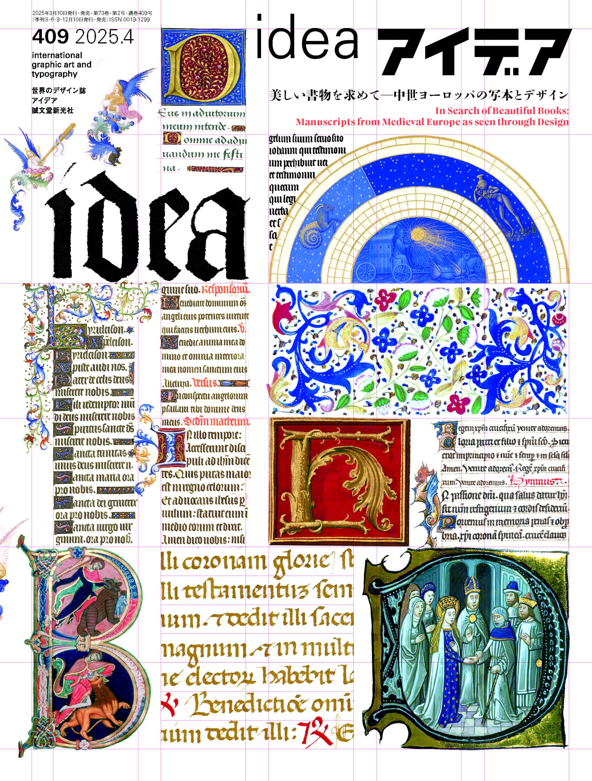
Manuscripts are handwritten and illustrated copies of books made before the invention of printing. In medieval Europe, writing rooms called ‘scriptoriums’ were established in monasteries where ‘scribes’ would copy writings and illuminate onto paper (parchment) made from animal skin, such as sheep and calves.
Medieval manuscripts, such as Très Riches Heures du Duc de Berry (The Very Rich Hours of the Duke of Berry) which has been called the most beautiful book in the world, and one of Ireland’s national treasures, The Book of Kells, are known for their lavish use of gold leaf and abundant colorful illuminations. Manuscripts such as these are revered not only as religious texts but as objects with intrinsic artistic value.
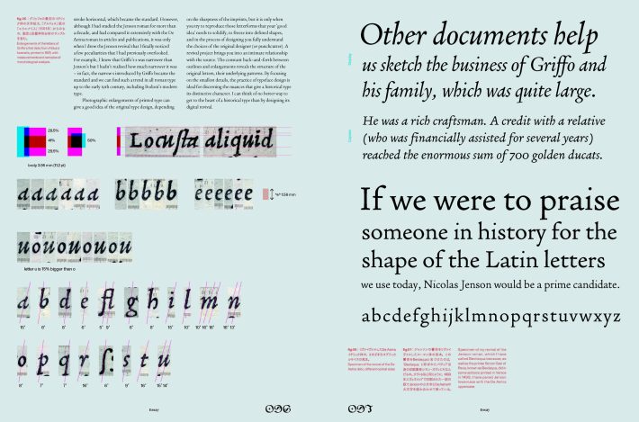
Though light has seldom been shed on manuscripts from a reader-conscious design perspective—i.e. the design of margins, page layouts, and colour schemes—the scribes involved in the creation of these manuscripts were, without doubt, pioneers of modern graphic design. Their consideration of text sizes, colour schemes, and the occasional infographic offering visual assistance helped readers of the era understand better.
This issue’s feature focuses on the “design” of books created by these scribes, and by analyzing their layout formats, binding methods, color schemes, and calligraphic styles, we shall attempt to explore their connection to contemporary graphic design. Manuscripts were created with processes similar to modern DTP and design, such as establishing guidelines to arrange text as beautifully as possible, setting aside space for illustrations and illuminated initials in advance, and having an illuminator fill them in afterwards (p.25). In addition, among the ever-present design “constraints”, manuscripts made use of “free space” (unused white space in pages), where the scribes and illuminators would demonstrate their imaginativeness (p.33). we will be exploring their ingenuity and passion for book making in an attempt to reconsider the idea of beautiful books.
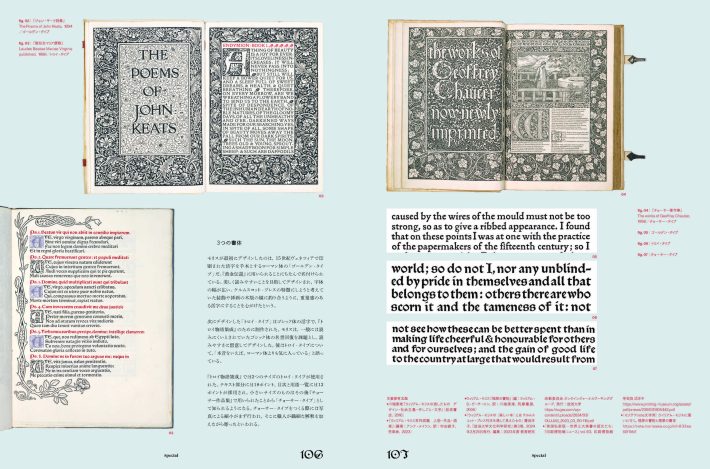
Known as the “father of modern design,” when William Morris laid the foundations for book design he placed these medieval manuscripts on the pedestal of idealism, and established his printing company Kelmscott Press to pursue their aesthetic form. Discussions of the history of grids and typography—invaluable elements in book design—often begin with incunabula, which were books printed during the transition between handwritten manuscripts and letterpress printing, invented by Gutenberg in the 15th century. Incunabula began with the imitation of medieval manuscripts, however; gleaning knowledge from these volumes should provide an opportunity to reconsider where the essence of beautiful lettering and layout lies, and the very nature of the book itself.
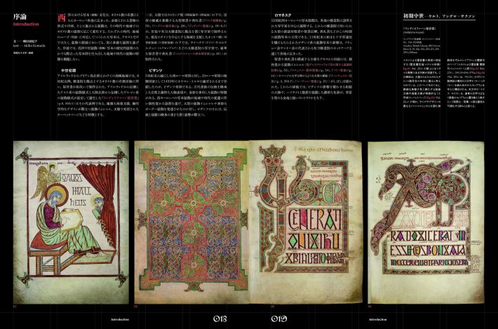
[Introduction]
Text by Akiko Komada
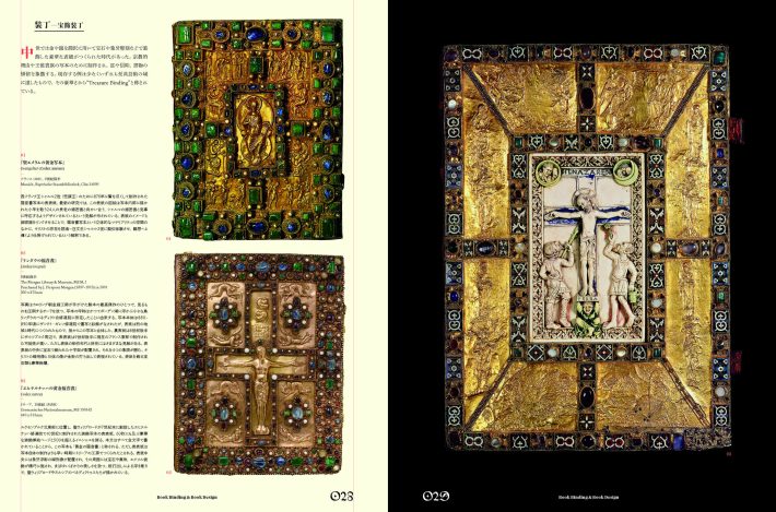
[Book Binding & Book Design]
Text by Satoko Tokunaga
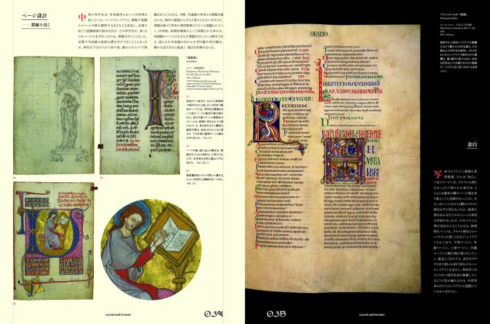
[Layout and Format]
Text by Mayumi Ikeda
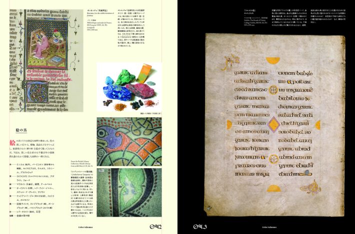
[Color Schemes]
Text by Yayoi Nishimura
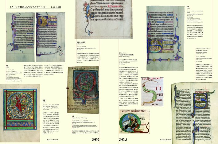
[Illuminated Initials]
Text by Takami Matsuda
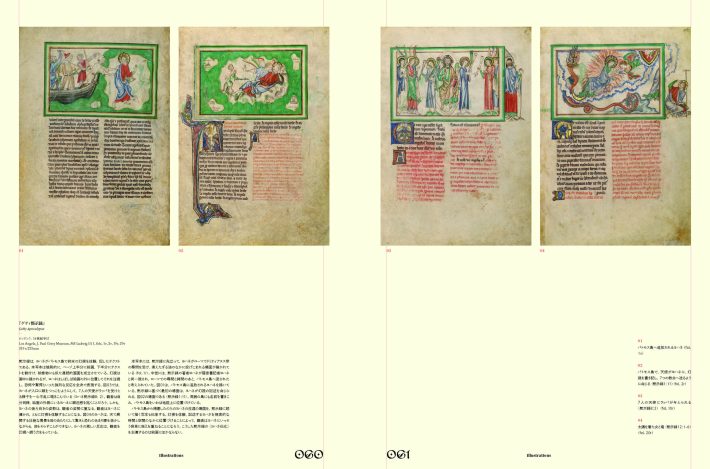
[Illustrations]
Text by Kumiko Maekawa
[Historical Lettering and Script Styles]
Text by Yayoi Nishimura
[Essay]
Books and Reading in Medieval Europe
Text by Shiro Miyashita
The Legacy Transferred:
From Manuscripts to Print
Text by Yoshihisa Shirai
The History of Blackletter and Roman Type:
The Connection Between Manuscripts and Typography
Text by Mitsuo Kono
Type Revivals as a Lens through Which to Learn History
Text by Riccardo Olocco
Translation by Manami Yamamoto
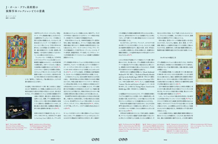
The J. Paul Getty Museum’s Collection of Illuminated Manuscripts and Their Significance
Text by Reed O’Mara
Translation by Manami Yamamoto
[Special]
The Ideal Book:
Connecting Tradition with the Evolution of Design
Text by Idea
[Column]
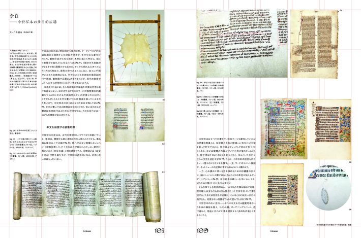
Margins:
The Multipurpose Space of Medieval Manuscripts
Text by Kenji Yagi
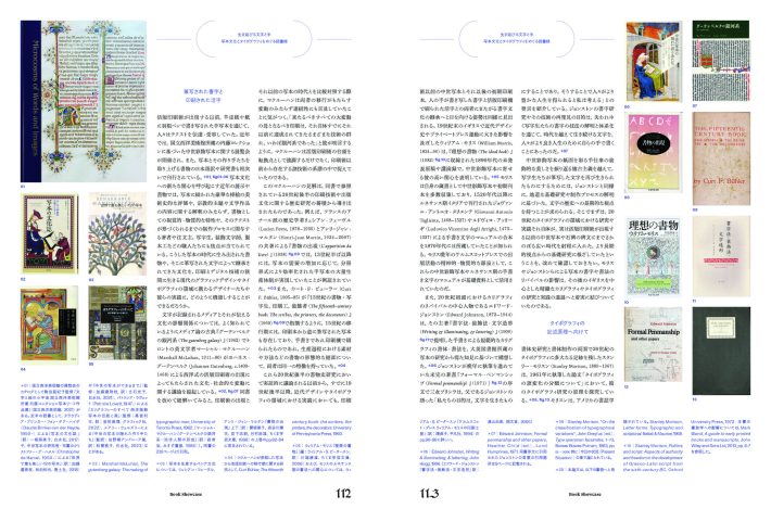
[Book Showcase]
Surviving Letters and Hands:
Reading on Manuscript Culture and Typography
Text by Toshiaki Koga
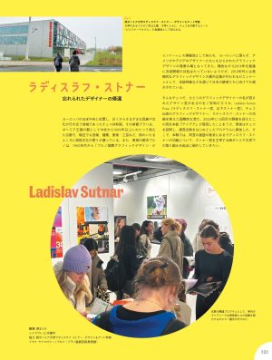
Ladislav Sutnar
The Return of a Forgotten Designer
Edited by Madoka Nishi Layout by Junpei Niki
Cooperation: The Ladislav Sutnar Faculty of Design and Art,
University of West Bohemia,
Iva Janáková-Knobloch (Museum of Decorative Arts in Prague)
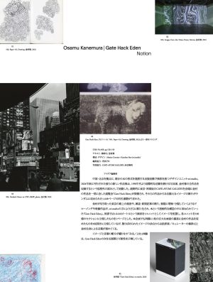
Osamu Kanemura Gate Hack Eden: Notion
Text: Gen Umezu, Osamu Kanemura
Design: Maxim Cormier+Xuechen Fan(ori.studio)
Editing cooperation: Madoka Nishi
Photo cooperation: CAVE-AYUMI GALLERY, Takaaki Akaishi
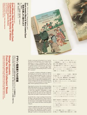
[Series]Design Eccentric From the World Collectors’ Room
Vol. 9: The Design Reviewed Archive, part 1
East meets West & West meets East:
Captivated by the Beauty of Wahon (Traditional Japanese Books)
Text by Yuko Nakajima
Design by Kazuhiro Yamada + Akiko Takeo (nipponia)
Translation by Fraze Craze Inc.
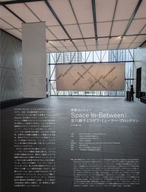
[Exhibition Review]
Space In-Between: Shizuko Yoshikawa and Josef Müller-Brockmann
Text by Ichiro Saga
Design by Toshinobu Nagata
[Information]
[Book]